
By Alicia Disantis, Brand Manager at Aux
I remember the day when the Pantone Color Institute announced their annual color of the year selection for 2021. It was early December 2020, and things were not going…great. Pandemic infection rates were surging into the holiday season, political unrest in the Whitehouse was mounting, my elderly mother-in-law was into her third week of being bedridden with COVID, and I was not feeling the holiday spirit. Home-grown pumpkins were still scattered across my coffee table, in a defiant attempt to ignore the pressure of the “most wonderful time of year.” I was working a lot and running a lot and sleeping a lot; anything to get my mind off the real world.
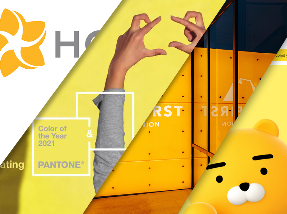
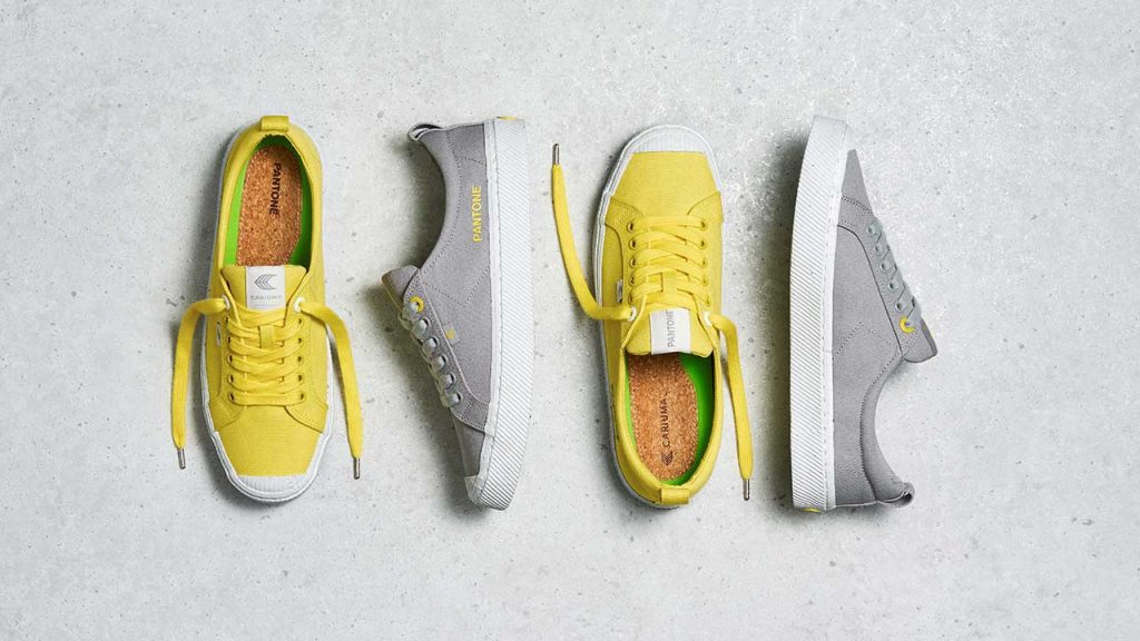
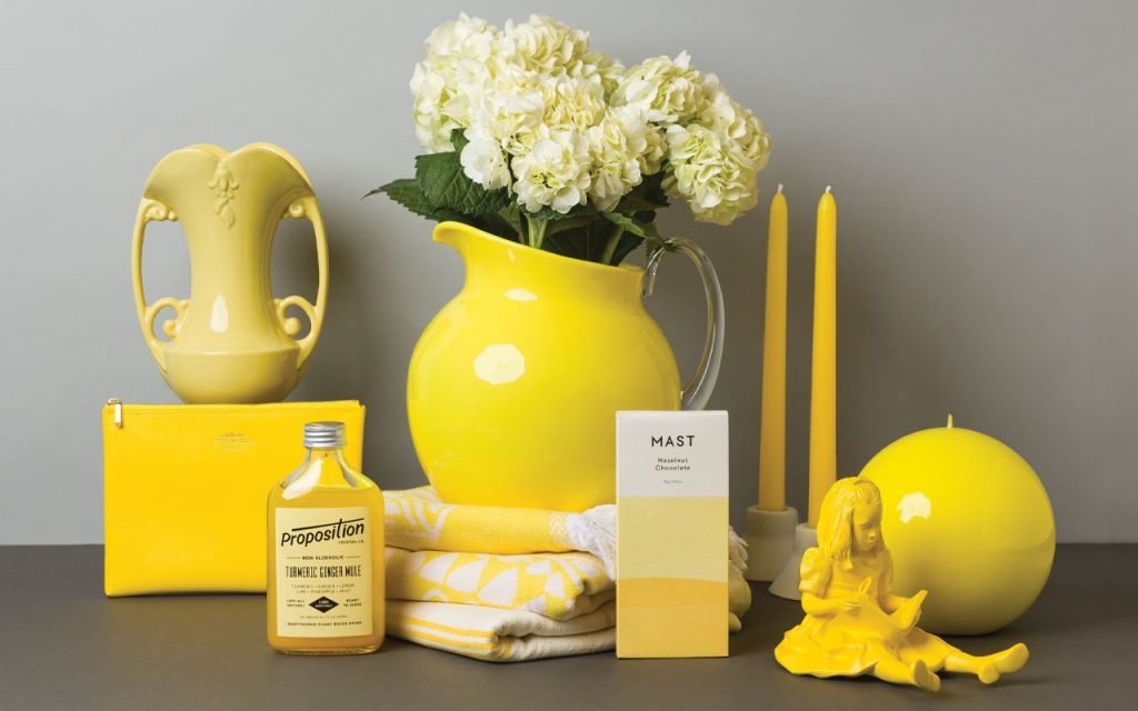
When lo and behold, Pantone announced their color selection – two colors, in fact: a cheery, vibrant buttercup yellow and a sleek, neutral grey. These colors were crowned as the two most important colors in 2021, and would influence everything from graphic design, to fashion, to interior decorating. Pantone’s annual color selection is an enormously influential moment for anyone across the globe who touches branding, marketing, design, and art. It’s a big deal.
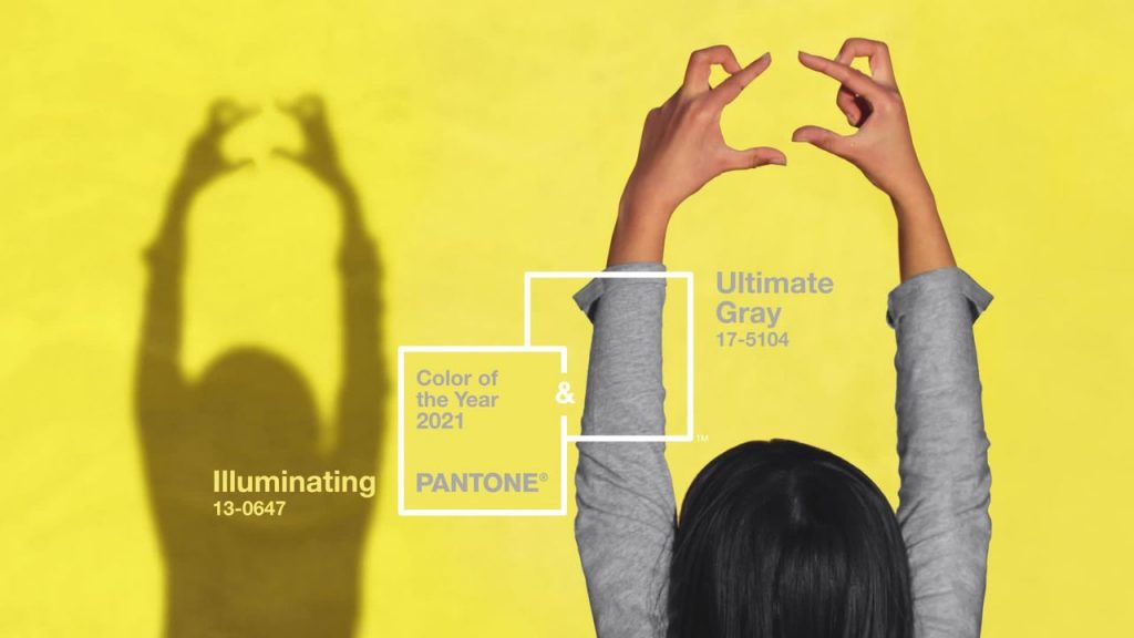
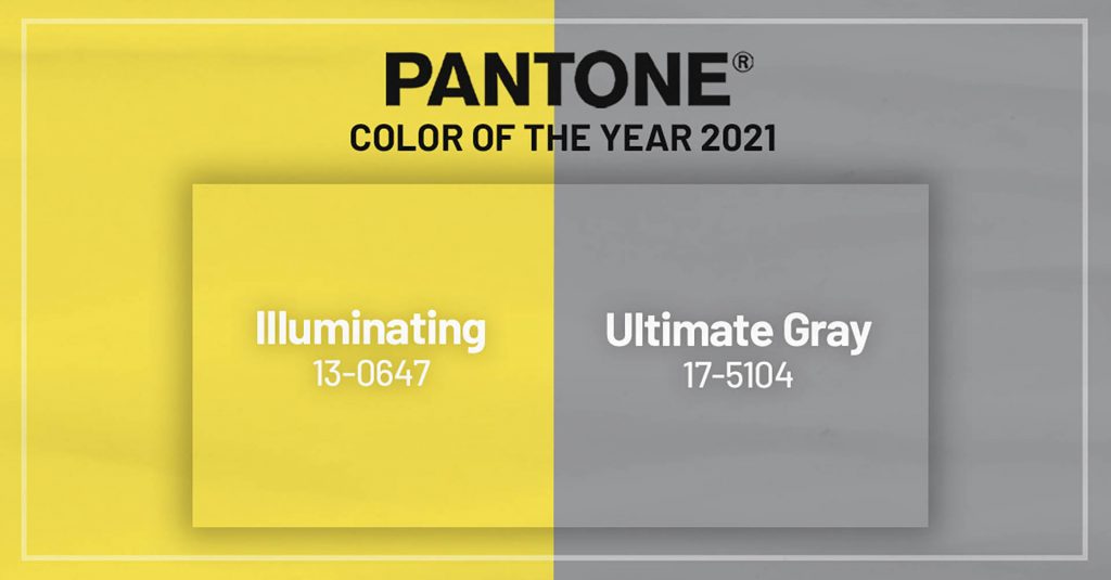
By now, you’ve surely seen this color combination in a variety of applications. “It’s a combination that speaks to the resilience, the optimism and hope and positivity that we need, as we reset, renew, reimagine and reinvent,” said Laurie Pressman, vice president of the Pantone Color Institute in a CNN interview. “Two extremely independent colors highlight how different elements come together to express this message of strength and hopefulness.”


In the spirit of collaboration and purpose-driven branding, I wanted to know if the alternative players the financial industry, the non-big banks, if you will, were embracing the Pantone Color of the Year. These players are plentiful: credit unions, smaller banks and neobanks, FinTech, a variety of apps, crypto. How were they incorporating yellow and grey into their logos, designs, lobbies, websites, and marketing?
But first…
Let’s talk about Yellow and Grey
Yellow is a wildcard. It connotes many emotions and meanings across cultures, from warning, to happiness, to mourning. It is bright. In fact, it is the easiest color for the human eye to see. “Our eyes are most sensitive to yellow and green, so they’re the easiest colors for us to see, even when we’re not looking directly at them. And even people with red-green color blindness can still see yellow, that’s why it’s the most popular color for highlighters,” says Laura Leslie of a Moment of Science. You can learn all about the unique effects yellow has on our brains in this fun article.
Now, let’s not get too excited about grey, but the shade of grey Pantone selected, “ultimate grey” is unique because it is very neutral. Many people do not realize how many different shades of grey exist. Next time you visit Home Depot, check out the grey paint chips. There are hundreds, if not thousands of grey, and they only look different when compared against each other. Very warm greys can look red against ice cold greys.
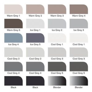
Just look at all these greys! You can even have warm and cool blacks, based on how they are mixed. You can’t argue with a name like “ultimate grey.” It is going to be very, very grey. The greyest of grey.

As a quick way to gauge the current perception surrounding color usage in financial services, I created four logo versions for a fake company, with the only difference being the logo’s color palette. I then asked a sample of 25 professionals across Facebook and LinkedIn to choose which FI they would do business with purely based on the logo.
![]()
Not surprising to anyone I am sure, B took the prize with 65% of the votes. Participants commented that B evokes calm, trust, and professionalism. Which version came in second place? C, with 25% of the votes. The Pantone Colors of the Year version, D, had just 9% of votes. What does this mean? I am not sure. Was my sample biased? Maybe, but I do feel this is a pretty accurate representation of color preference in the industry. Which version would you choose?
Now, without further ado, let’s explore a variety of examples showcasing how alternative financial institutions are incorporating the Pantone Colors of the Year.
Credit Unions
I would be remiss if I didn’t begin my research with the credit union community, a scrappy group I have been a part of for nearly a decade. Credit unions tend to be smaller and nimbler when it comes to marketing and branding. What they lack in big budgets they make up for in adaptability and efficiency, which allows them to incorporate trends easier, without a chain of signoffs and bureaucracy. Let’s face it: Are Chase or Bank of America really going to throw some yellow into their lobbies?
I’ll begin with HOCU, a Honolulu-based credit union who is making incredible use of these colors. In previous Pantone Color of the Year articles, I have featured Hawaii-based credit unions; they seem to embrace color and creativity in a bold way, fearlessly incorporating trends. And doesn’t HOCU’s brand just look incredible? I also love how they used actual on-site photos, not purchased stock photography.
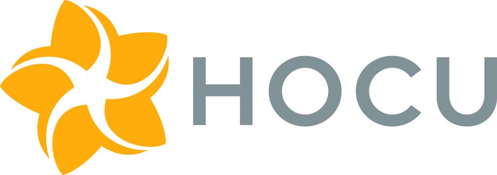
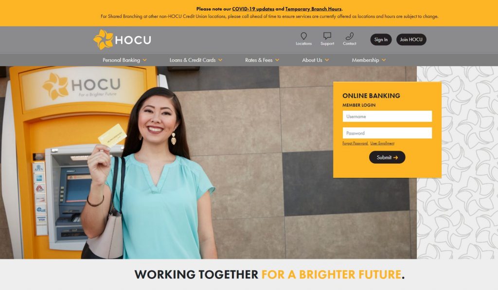

Don’t you just love how that marigold yellow pops against the warm grey and bright white?

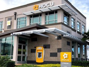
Let’s travel 3,200 miles east to Pocatello, ID, home of Lookout CU, Idaho State University’s (enrollment 22,000) community credit union. The contrast between HOCU’s and Lookout’s brands illustrate the diversity in color usage, even within a niche industry. Two very different organizations, in two very different cultures and locations, have made elegant use of a similar color palette.
![]()


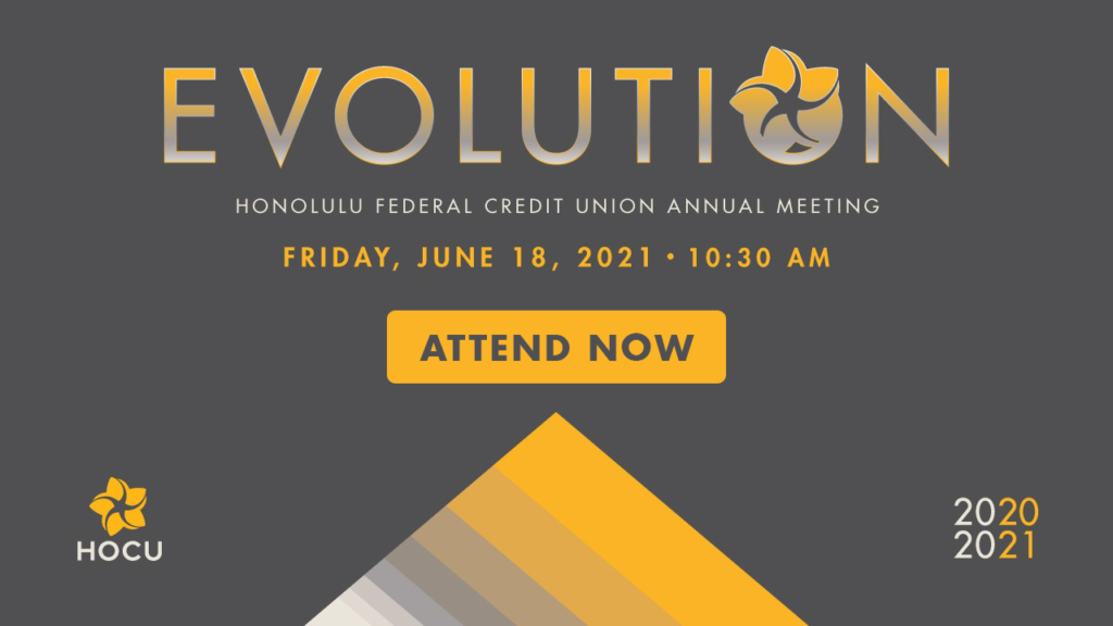
Lookout CU’s rebrand was a two-year project that was completed at the end of 2020. BJ Fillingame, Vice President of Marketing at Lookout CU, filled us in on the project.
“The Lookout Credit Union rebrand represents our passion and connection to a way of life, our deep sense of community and an organizational pride for the positive impact we strive to make in our members lives. Our colors are inspired by our surroundings, grounded in nature, and injected with energy. Color is an instant identifier for Lookout Credit Union, and we don’t shy away from using it,” he wrote.
One can easily see how color inspired their brand in this photo of Pocatello.

For a purist example of 2021 Pantone color usage, check out LGFCU’s logo. They are located in Raleigh, NC and have a membership base of state and local employees.

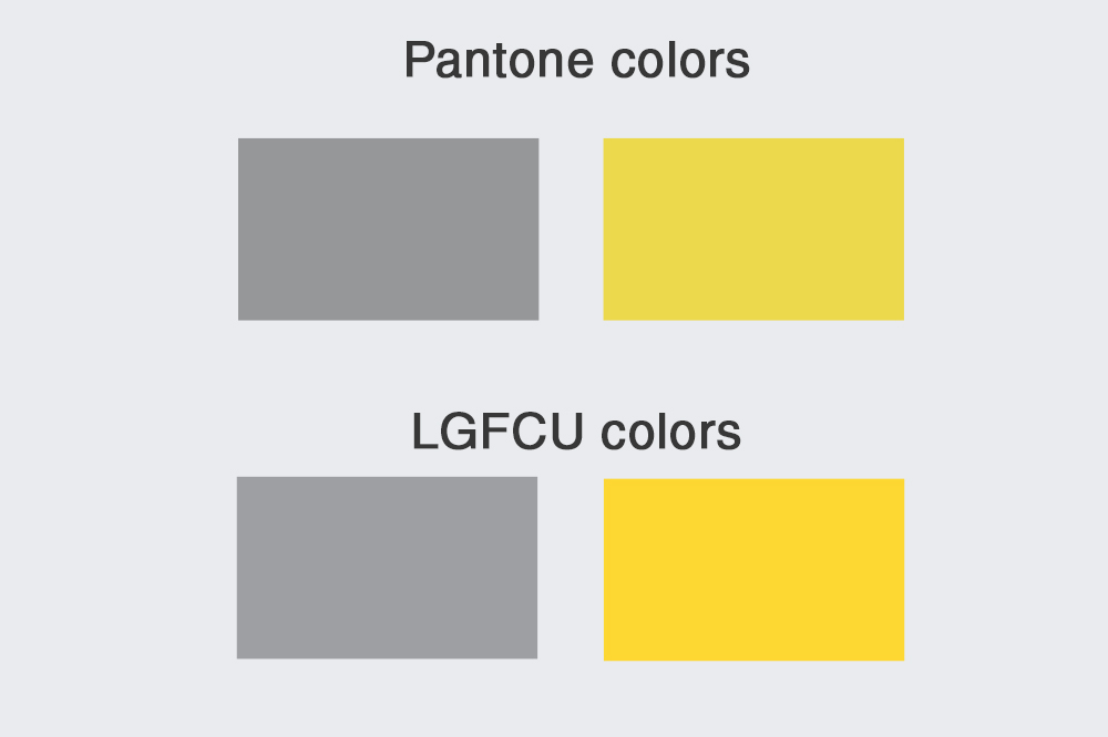
I mean…come on. You aren’t gonna get much closer than this for color similarity!
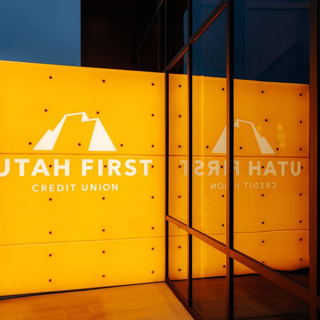
Let’s head a few miles west to Salt Lake City-based Utah CU for a lovely example of yellow and grey in branch design. Their corporate headquarters are a combination of both urban and cozy, created by the warm glow of marigold.

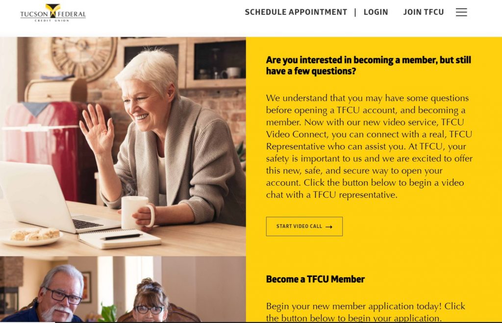
Last but not least, we’ll head to the border to check out Tucson FCU’s brand. Their use of “illuminating” yellow throughout their website is demanding but welcoming. You can’t help but read the web copy in the bright yellow boxes. It slaps you across the face and tells you where to look. And that is the beauty of using yellow in design.
![]()

Banks
Let’s now focus on banks, at a community, national, and global level. I love showcasing what financial institutions are doing in other countries and how their customers respond and experience color in a different way than Americans. Studies show that humans are deeply impacted by color at a cultural level. Just take a look at this fascinating article about why Japanese traffic lights are blue instead of green.
And this in-depth article explains how cultures not only have unique words and designations to describe colors, but some undeveloped cultures do not even have words for colors!
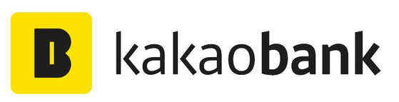
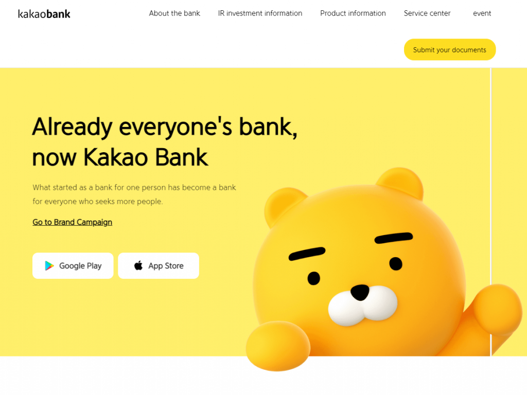
Let’s take a look at Kakao Bank’s branding, which uses “illuminating” yellow in their logo, website, and mobile components. They are a mobile-only South Korean bank who supposedly attracted 240,000 users in the first 24 hours of launching. Yellow is a very significant color in Korean culture. The Pujok, a bright yellow talisman hung over entrance doors in Korean homes, acts as a good luck charm and wards off bad spirits. You’ll see a very similar color is used for their logo identity.
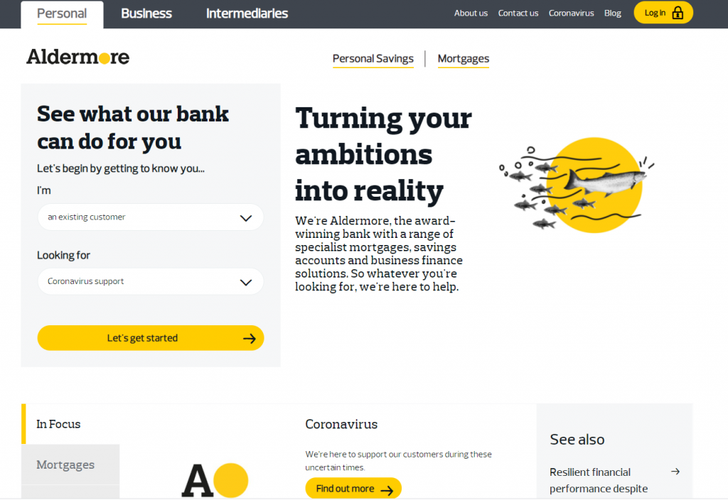
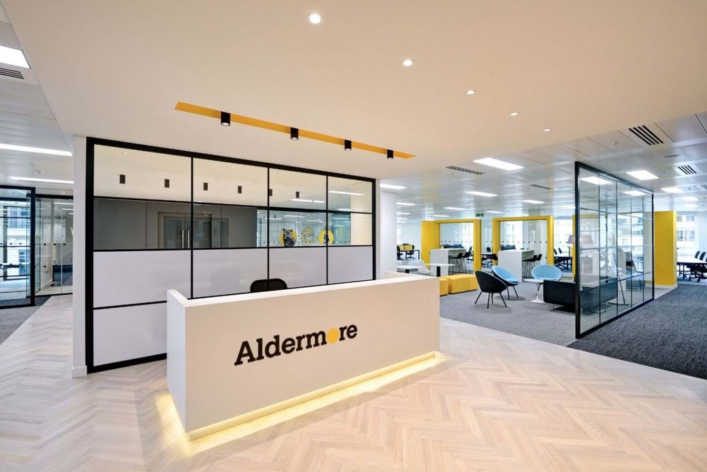
A personal favorite is Aldermore Bank, out of Reading, UK, which is just west of London. They provide financial business services to small and medium businesses only. Their brand is fresh, original and a great example of how a bright yellow and neutral grey palette can be effective across many marketing channels. Combined with a quirky animal-based motif and uncluttered design, they speak to the busy but down-to-earth business owner who rejects the marble floors and pillars of big bank life.

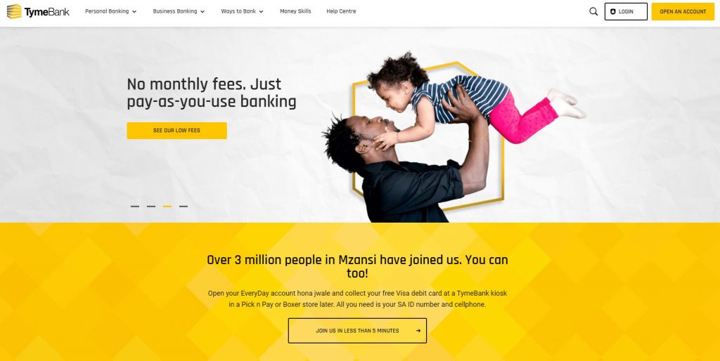
Tyme Bank, based in Johannesburg, South Africa is a digital only neo bank. Their simple, mid-century modern logo and airy website lean into Pantone’s Colors of the Year unapologetically. Note: In an attempt to not write a blanket statement for the whole of Africa as many do: Yellow is considered a color representing success and prosperity in many African cultures, but I could not find specifics on South Africa.
![]()
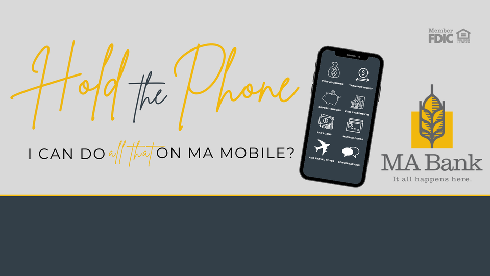
Let’s head back to the USA. MA Bank is a small community bank located in Missouri. They reside in the definition of rural, right smack in the middle of a Bermuda triangle of St. Louis, Kansas City, and Des Moines – population 5,500. But look at how lovely their brand is. MA Bank is a tremendous example of a small time FI investing in design and brand, and a compelling case of “perception is reality” in branding. You would never think this logo was that of a small, midwestern bank. **wipes tear from eye**

![]()
Financial Services and Cryptocurrency
Our last category of focus includes catch-all financial services – those entities that aren’t banks or credit unions but offer services within the financial realm. This category, especially crypto, is positively exploding with new players and innovative brands. Let’s take a look.
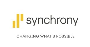
You couldn’t help but smile at Syncrony Financial’s cheerful logo, website, and retail locations. Headquartered in Stamford, Connecticut, they specialize in consumer loans, credit and purchase planning. Doesn’t that bright yellow just make you want to spend SPEND, SPEND!? Something tells me that’s what they were going for.


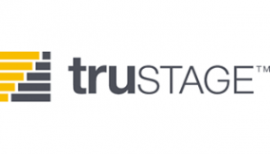
And my boss, Alan Bergstrom, who has been in the branding business for a couple of decades, reminded me that one of his efforts was the creation of CUNA Mutual Group’s TruStage direct-to-consumer insurance products brand about 10 years ago (2011). Yes, it was yellow and grey and still is today. Just consider him the “Nostradamus” of branding. Perhaps I should ask him what next year’s color(s) will be? Note: he wrote this paragraph

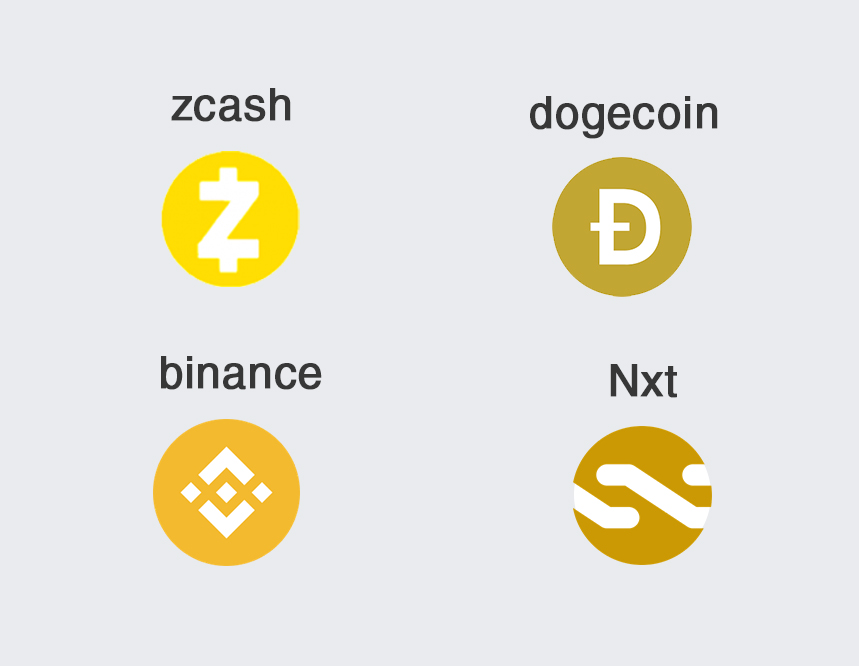
Onto everyone’s favorite topic…cryptocurrency, the buzzword of the century. Whether you love it, hate it, are terrified of it, or are investing in it, it won’t be ignored. The crypto design realm is full of energy and innovation. I’ll admit that I look to crypto design for inspiration, and with new offerings seemingly every day, there is no shortage of it. Yellow is a popular color choice, linking back to the symbolic gold “coin” color that the crypto movement was born from.
Conclusion
If you’ve made it this far, then you’ve seen your days’ worth of yellow. Are you feeling hopeful? Optimistic? Resilient, as the experts at the Pantone Color Institute hypothesized you would?
I’ll be honest with you, I am. Yellow and grey are not colors I much care for, but writing this article gave me a new appreciation for this color combination within a branding framework. “Illuminating” yellow, even in small quantities, can encourage customers to take a certain action, i.e., click a button or read critical text. It can brighten a marketing campaign without adding bulk or whimsy. It can distinguish your brand from a sea of cobalt blue and cherry reds. And I’ll close with this question: Would you be willing to try it out?
About the Author

Alicia is responsible for strengthening and growing the Aux brand and spreading the word on the extraordinary benefits of collaboration and shared services. Working alongside the Business Development team and product managers, she manages the corporate brand, including writing, graphic design, advertising, and social media. Alicia has seen Aux grow from a regional shared branching support CUSO to a powerhouse in innovation and R&D. A typical industry “wearer of many hats,” she loves working in such a caring and compassionate industry as credit unions.