

Yes…But Only in Certain Regions.
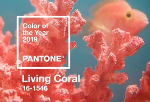
If you thought last year’s Pantone Color of the Year (Ultra Violet) was a tough choice for financial institutions to embrace, then hold onto your hats folks, because this year’s color is coral. Not just any coral, but LIVING coral. Hi everyone, your friendly marketer/designer Alicia here with another annual rendition of analyzing how FIs are interacting with the hottest color of the year – the PANTONE Color of the Year.
 Pantone writes: Vibrant, yet mellow PANTONE Living Coral embraces us with warmth and nourishment to provide comfort and buoyancy in our continually shifting environment.
In reaction to the onslaught of digital technology and social media increasingly embedding into daily life, we are seeking authentic and immersive experiences that enable connection and intimacy. Sociable and spirited, the engaging nature of PANTONE Living Coral welcomes and encourages lighthearted activity.
Representing the fusion of modern life, PANTONE Living Coral is a nurturing color that appears in our natural surroundings and at the same time, displays a lively presence within social media.
Key Takeaways:
1. The horrible stuff going on in the world is making us stressed, so we need a relaxing color in our life.
2. Social Media is making us feel freaked out, so we need a relaxing color in our life.
3. We never go out and instead stare at screens all day, so we need a relaxing color in our life.
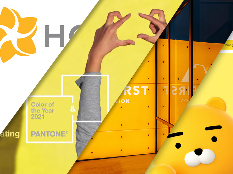
Blue and red have always dominated the banking branding sphere. Finance isn’t exactly an industry where one wants to invest money in a trendy persona. On the whole, FIs want to be seen as rock solid, consistent, conservative and mature. A progessive-minded FI might go out on a limb and embrace a contemporary brand color, like a green (as we saw in 2017’s PANTONE Greenery), fiery orange or bright yellow. An even more brazen FI might embrace purple (as we saw sparingly in 2018’s PANTONE Ultra Violet). But coral? Peach? Delicate orangey-pinky sorbet? This one was tough.
Before I Dive Into My Findings, Some Background on this Color
Soft oranges/pinks date back to Medieval times, when the color was seen as a representation of the body of Christ; you can often find characters in Christian art wearing subtle, fleshy pink. During the 19th century, pink was used in ads and postcards, and soft pink was a very popular choice among men in industrialized nations. Pink was seen as a color of intellect, less harsh than war-like red, and represented youth and vigor. Men and women alike utilized pink in their fashion choices. Fun fact from our compliance team on the East Coast: Penn State’s colors were originally pink and black, but the pink kept fading to white. They changed to blue and white in 1890.
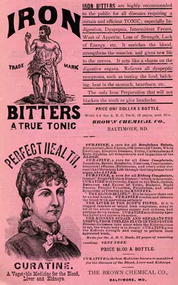

Pink was reserved for adults. One would be surprised to learn that pink was rarely used in a little girl’s, let alone any child’s color palette until modern times, as the dye faded easily and children would quickly dirty the fine hue. Only since the 1940s was pink associated with femininity and baby girls, due to a number of cultural changes, such as more defined baby genders and the women’s movement heavily utilizing the color. By the end of the 50s, pink of all shades (warm and cool) firmly rooted down as a feminine color in modern nations’ psyches. In the past few years, we have seen this color embraced more and more by both genders: “Millennial Pink,” as many have coined the sweeping trend. From shoes, to interior design, to advertising, pink is everywhere.
 Location, Location, Location
A fascinating trend I discovered while studying whether FIs are embracing Living Coral was that the utilization hinged entirely on region. As one would expect, the vast majority of banks and credit unions are shying away from such a delicate and oft-perceived as feminine color. However, there are plenty of FIs that have fully embraced the color, from logos to branch design, and the majority of them reside in warm, coastal climates. I had trouble finding even one FI that was utilizing coral in a temperate, primarily inland region – say Minneapolis or Berlin. Coastal United States, as well as a saturated Australia, have used the color heartily.
One of the biggest players embracing Living Coral is $7.2B Bethpage FCU, based out of Long Island, NY. Their logo is contemporary gradient of yellow and red (creating a soft orangey color), anchored by teal. More notably however is the color used in their community outreach and tradeshow presence – a perfect Living Coral! Who would have believed it?
![]()
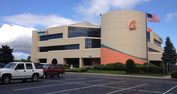

I was excited when I saw that such a large FI, one of the biggest credit unions in the United States, was utilizing the color in the way PANTONE intended it – a representation of personal connection, warmth, and nurturing relationships. Surely Bethpage FCU will set the stage for many other credit unions to follow with a contemporary and warm brand color palette.
Moving down the East Coast to Florida are a handful of credit unions and banks that use a coral color palette in their branding. Most fitting, of course, is Coral FCU out of Ft. Lauderdale. This is your year to shine, Coral FCU!
South Florida FCU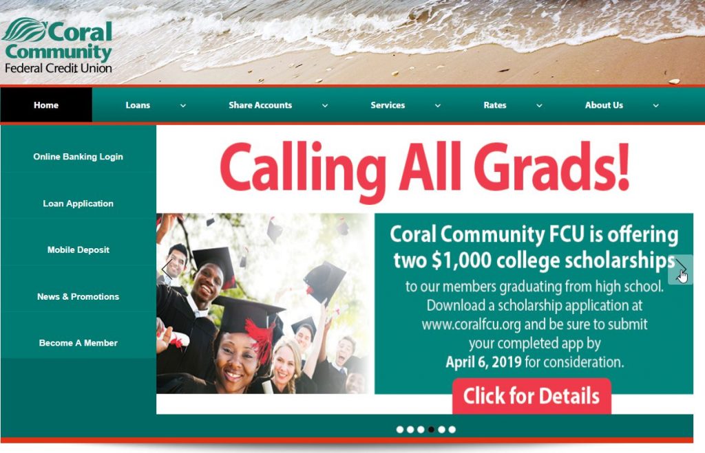 in Miami also uses a modern coral-pink palette, representing their coastal heritage.
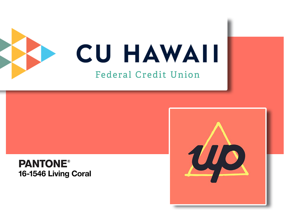
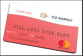
 Taking the long haul across the U.S. and the Pacific Ocean to Hawaii, we encounter numerous FIs embracing this year’s PANTONE color. CU Hawaii, based out of Hilo, HI is another great illustration of how to use warm, welcoming coral in a color palette that is not overwhelming or gender-specific.
![]()

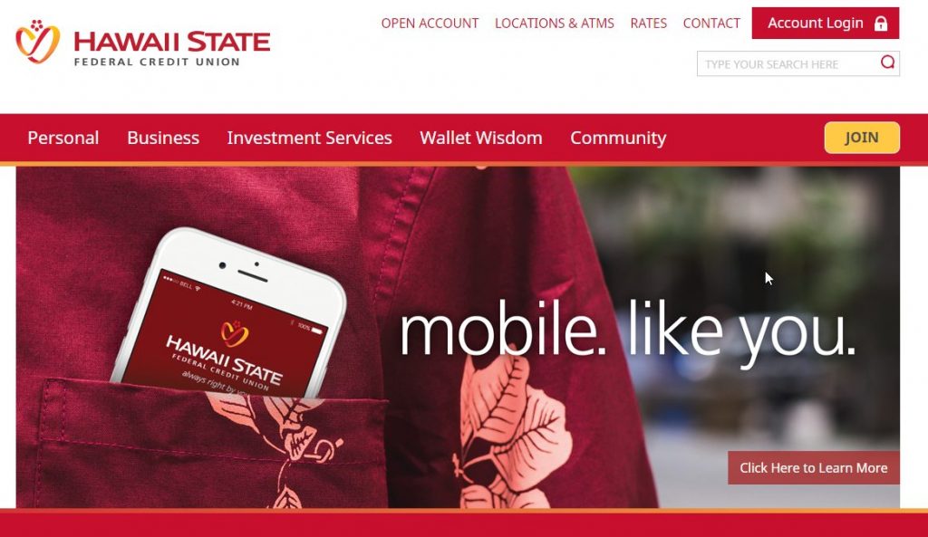
Check out Hawaii State FCU’s brand with it’s bright oranges, reds and corals.
 The Land of Coral and Koalas
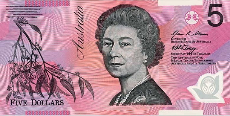
Where Living Coral really shines among banks and credit unions is in Australia. Having spent a lovely summer along Australia’s Eastern Coast, I can see why this continent is a prime embracer of the color. They are warm, progressive, the majority of people enjoy a coastal lifestyle, and maybe most importantly, they house the largest coral reef on the globe. Perhaps this fusion of nature and culture has allowed Australian FIs to be so open with a notoriously underused business color. Even their money is coral colored!
 Take a look what I consider to be the shining example of Living Coral in use: Up Bank, a newly-launched 2018 Australian digital bank.
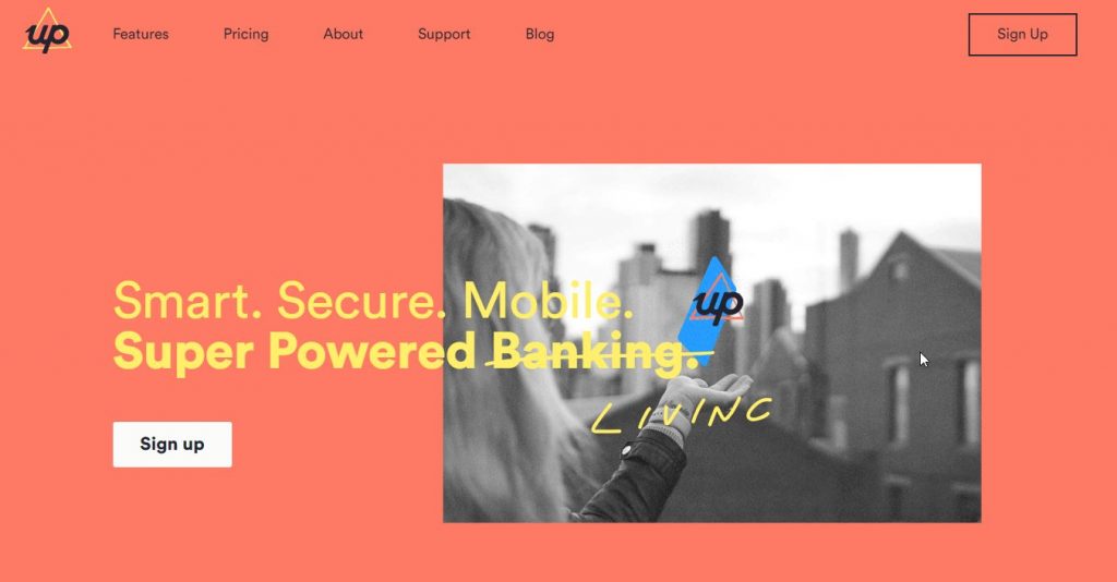
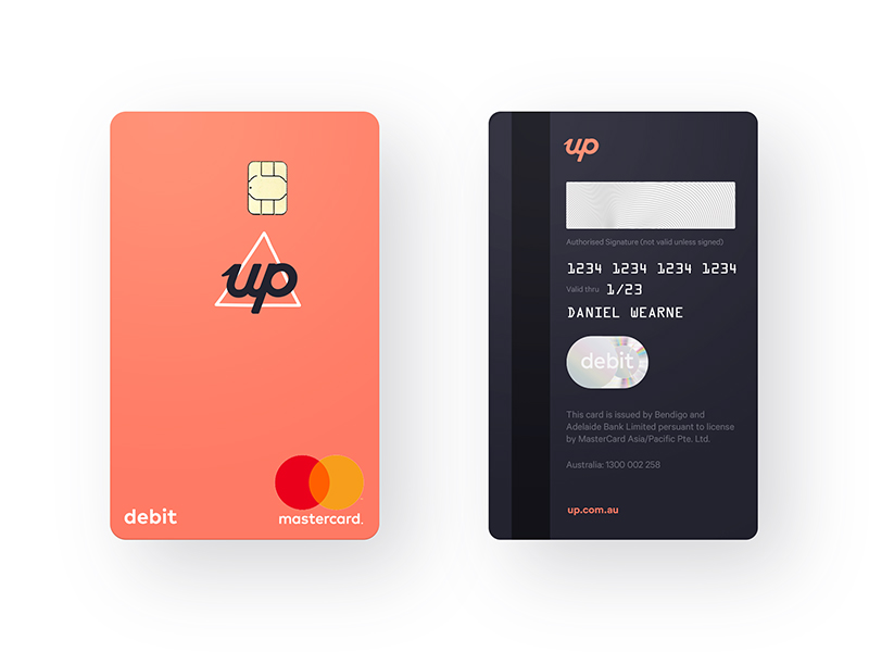

![]() I will pay anyone $100 to find me a FI brand that is more Living Coral than UP Bank.
I will pay anyone $100 to find me a FI brand that is more Living Coral than UP Bank.
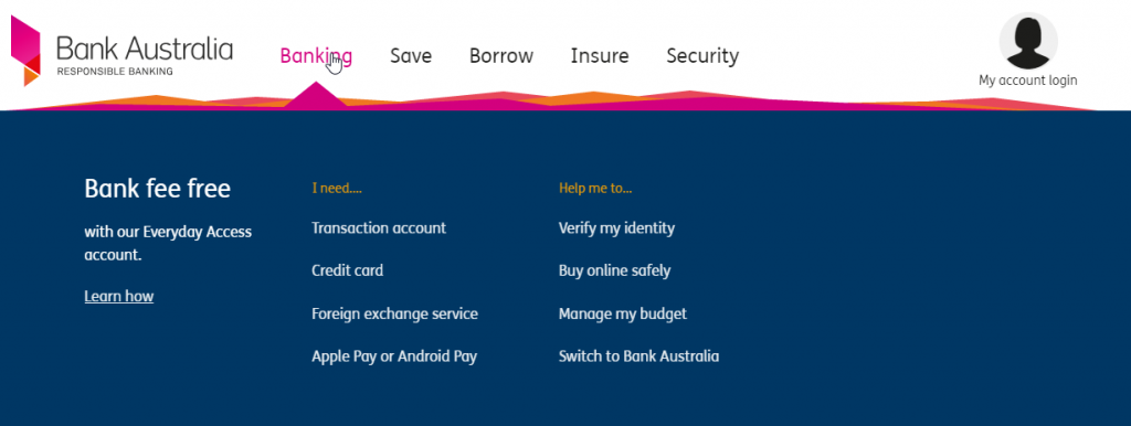
Bank Australia, formerly Members and Education Credit Union, is a community bank out of Victoria, Australia. They have a super crisp palette of navy, pink and coral. This is another great example of how coral can be used in small ways to make a brand shine and stand apart. Imagine if Bank Australia didn’t have that pop of coral. It would look like every other standard FI website out there.
The Mac CUin Camden, NSW, Australia has a playful brand and although they rely mostly on an orange palette, coral is used in promotional items like the one below.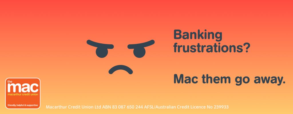
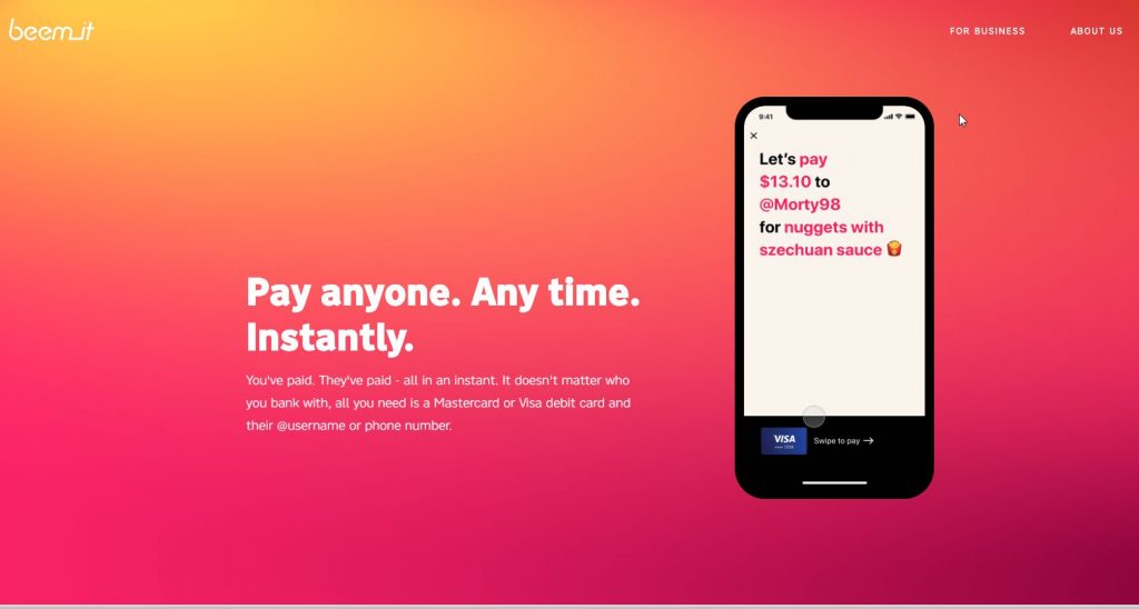
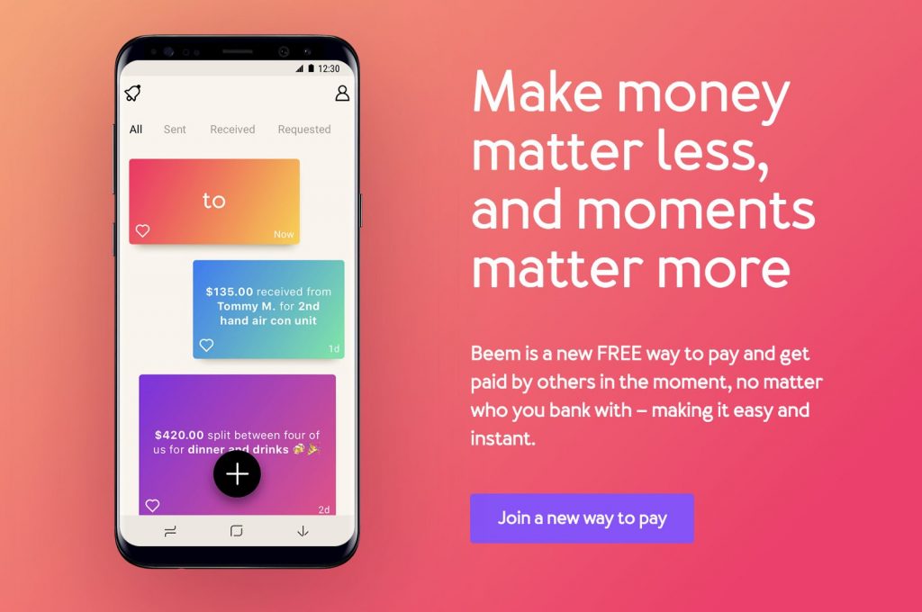
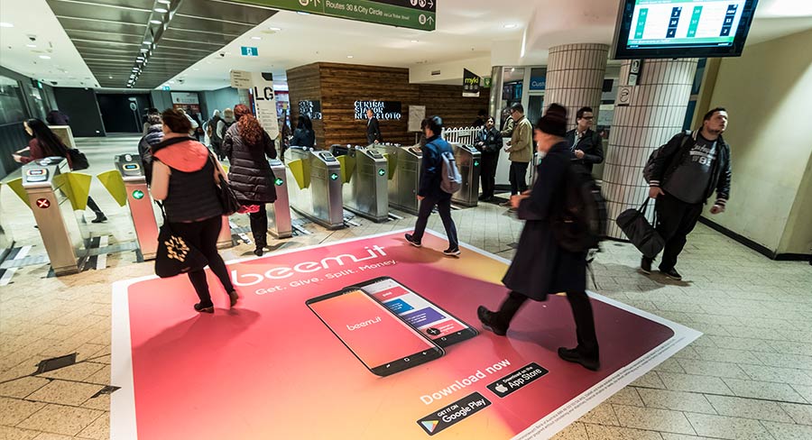
Beem, the Australia version of Venmo, also incorporates a very bright and bold coral color palette into their website. See what I mean about Australia loving this coral color?
 And there you have it folks. This was a tricky one. If you know of any banks or credit unions who are using Living Coral in their brand, please comment and let me know!